

Template Support
Arbor Template Guide
Everything you need to know about the pages and special features included with your Arbor template.
Start Here
New to customizing your template?
Before diving into the Arbor-specific features below, start with the Template Setup Guide. It covers everything you need to customize your branding and content, set up your site, prepare your SEO, and get ready to launch.

What's Included
Step inside Arbor.
Arbor includes the core pages and layouts you need to build a complete photography website. Customize, rename, or repurpose them to fit your business and services.
SITE PAGES
Home
Project 1
About
Project 2
Portfolio
Project 3
Investment
Coming Soon
Contact
404
BLOG TEMPLATES
Blog
Single Post
Page
Template Features
How it all works.
Arbor includes many unique layouts and interactive features throughout the template. The guide below is organized by page, so you can easily find the tips and instructions you need as you customize each part of your site.
Site-Wide Features
01 — Desktop + Mobile Elements
Some sections in Arbor use separate elements or canvases for the desktop and mobile layouts. This allows certain parts of the design to be arranged or behave differently for each screen size.
Because these versions are separate, changes made to the desktop version will not automatically update the mobile version. When a section has separate desktop and mobile canvases, be sure to update the content in both.
Elements or canvases that aren’t needed on one layout may appear hidden rather than deleted. Before removing anything that appears hidden, check whether it’s being used on the other layout.
BEFORE YOU LAUNCH — Review your entire site on both desktop and mobile and make sure all placeholder copy, images, links, and other template content have been replaced in each layout.
A QUICK TIP — In Showit, the crossed-out device icons in the left-hand panel indicate when an element or canvas is hidden on desktop or mobile.

02 — Sticky Canvases
Much of Arbor’s Home page is built using Sticky canvases to create its layered scrolling effects. As visitors move down the page, different sections remain in place, stack together, or scroll over one another to create the finished layouts you see on the live site.
When customizing the Home page, you can replace the text, images, and other content within these sections without changing the existing canvas setup.
IMPORTANT — KEEP YOUR CONTENT WITHIN THE EXISTING SPACE
Arbor’s Sticky sections have been tested across multiple desktop screen sizes to ensure all of the content remains visible as visitors scroll.
When replacing text or other content, avoid making it taller than the content already provided within that section. Adding significantly more content can cause parts of a Sticky canvas to extend beyond the visible browser window on smaller desktop screens.
If your content doesn’t comfortably fit within the existing space, consider shortening it rather than increasing the height of the section.
A QUICK NOTE — Keep the existing canvas heights, positioning, and Sticky settings in place unless you intentionally want to change the scrolling behavior. After customizing a Sticky section, preview your site at different browser heights to make sure all of your content remains visible.

03 — Instagram Feed
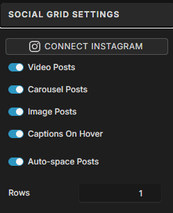
Arbor’s footer includes an Instagram feed designed to display your latest posts directly on your website. Before launching, connect the feed to your own Instagram account so the placeholder images are replaced with your content.
TO CONNECT YOUR INSTAGRAM
Follow Showit’s Instagram setup instructions to connect your account and authorize your Instagram feed. Once connected, your posts will populate the Instagram section in the footer.
A QUICK NOTE — The Instagram feed is part of Arbor’s shared footer Site Canvas, so you only need to set it up once for it to appear throughout your site.
CONNECT YOUR INSTAGRAM FEED
Follow Showit’s instructions to connect your Instagram account to the Social Grid in your footer. You’ll need a Creator or Business Instagram account to use this feature. You can always remove the Instagram feed if needed.

Home Page
01 — Stacking Story Sections
Arbor includes a three-part scrolling section that brings the words Stories Worth Remembering together as visitors move down the page. Each part of the design is built as a separate canvas using Showit’s Sticky setting, allowing the three sections to stack into one finished composition as you scroll.
TO CUSTOMIZE THIS SECTION
Replace the images within each canvas with your own while keeping the existing canvas layout and positioning in place. You can also update the text, but keep in mind that the three sections are designed to come together as one composition, so changing the wording may require some adjustment to the finished layout.
A QUICK NOTE — Avoid changing the canvas heights, positioning, or Sticky settings unless you intentionally want to change the scrolling effect. These settings work together to create the final stacked design.


02 — Selected Work Stacking Section
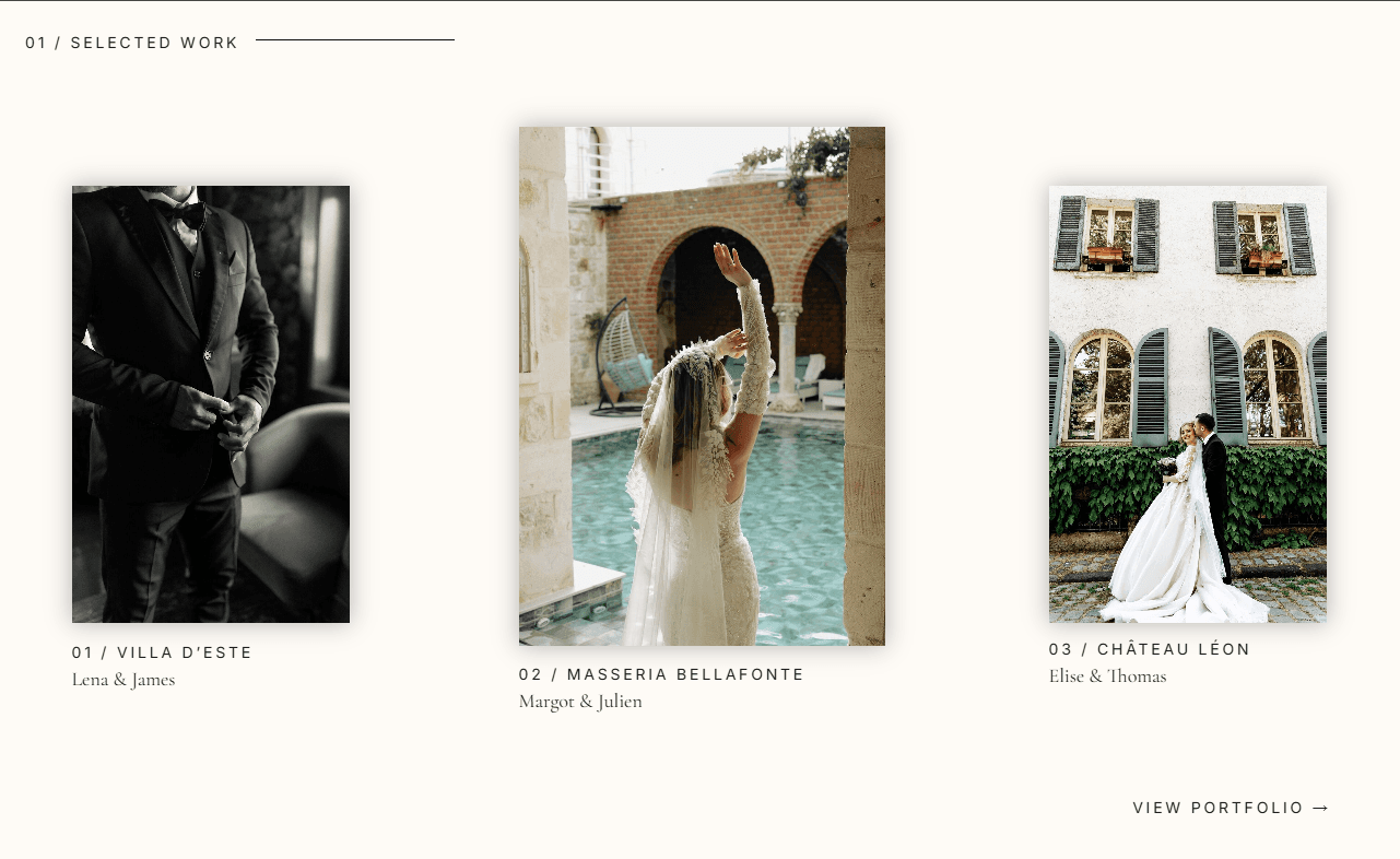
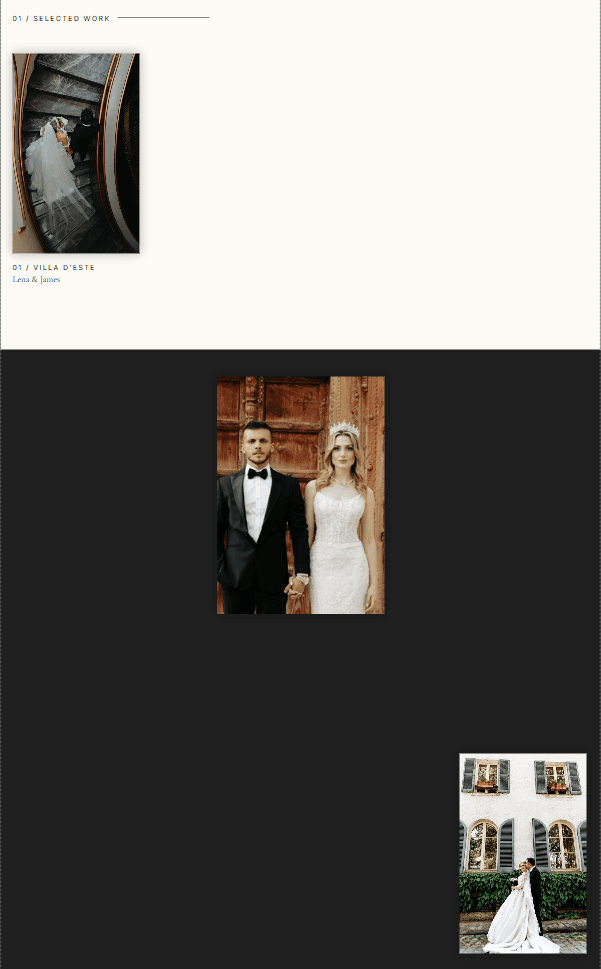
The Selected Work section uses the same Sticky canvas technique as the Stories Worth Remembering section above. Each project is contained within its own canvas and stacks into the finished three-project layout as visitors scroll.
Each project image is also a gallery, allowing multiple images from the project to rotate within the same space.
TO CUSTOMIZE THIS SECTION
Update the project name, client details, and links within each canvas with your own content.
To replace the project images, select the gallery and open Gallery Images in the right-hand panel. Remove the existing images, add your own, and drag them into the order you'd like them to appear.
Repeat this process for each of the three projects.
A QUICK NOTE — The galleries and Sticky canvases are already configured for you. You shouldn't need to adjust the gallery behavior or the canvas heights, positioning, or Sticky settings when replacing your content. Keeping these settings in place will preserve the intended gallery and stacking effects.
03 — Stacking Offerings
The Offerings section uses a stacking layout to reveal each service as visitors scroll. Each offering is contained within its own Sticky canvas, allowing the services to stack together as you move through the section.
TO CUSTOMIZE YOUR OFFERINGS
Replace the service names and descriptions with your own while keeping the existing canvas layout and positioning in place.
The service name and description are grouped together, with the Click Action applied to the entire group. To update where an offering leads, select the group and update its Click Action with the page or link for that service.
A QUICK NOTE — Keep the text elements grouped together so the Click Action continues to apply to the entire offering. Avoid changing the canvas heights, positioning, or Sticky settings if you want to preserve the existing stacking effect.


04 — Scrolling Testimonials
The Love Notes section includes four testimonials that scroll through the section as visitors move down the page, while the large image and heading remain in place.
TO CUSTOMIZE YOUR TESTIMONIALS
Replace each testimonial with your own client feedback, including the testimonial text, client name, location, and any other details you’d like to include.
Work through the testimonials one at a time, replacing the existing content. If your testimonials vary in length, adjust the spacing between them as needed to keep the section feeling balanced.
DON’T FORGET MOBILE
The scrolling testimonial layout is used on desktop only. Arbor includes a separate testimonial canvas for mobile with a simplified, non-scrolling layout. After updating your desktop testimonials, switch to the mobile layout and update the testimonial content there as well.

About Page
01 — Points of Reference Gallery
The Points of Reference section combines static images with a rotating gallery. The tall image on the right is a gallery, while the other images in this section are static.
TO UPDATE THE GALLERY
Select the gallery on the right, then open Gallery Images in the right-hand panel. Remove the existing images, add your own, and drag them into the order you’d like them to appear.
The remaining images can be replaced normally by selecting each image and choosing Swap Image.
A QUICK NOTE — The gallery is already styled and configured for you, so you shouldn’t need to adjust the Gallery Settings when simply replacing your images.


Portfolio Page
01 — Scrolling Galleries
The Portfolio page includes three scrolling galleries, one for each service type. Each gallery is already styled and configured to automatically move through your images.
TO CUSTOMIZE YOUR GALLERIES
Select each gallery and open Gallery Images in the right-hand panel. Remove the existing images, add your own, and drag them into the order you’d like them to appear.
Repeat this process for each of the three service galleries.
A QUICK NOTE — The scrolling behavior and styling are already set up for you. You shouldn’t need to adjust the Gallery Settings unless you intentionally want to change how a gallery looks or moves.


02 — Selected Work
The Selected Work section features three projects, with a separate gallery for each project. Both the gallery and the project text are clickable, giving visitors multiple ways to open the corresponding project.
TO CUSTOMIZE YOUR PROJECTS
Select each gallery and open Gallery Images to replace the existing photos with images from your own project.
Then update the project name and client details below each gallery.
Finally, update the Click Action on both the gallery and the project text so they lead to the correct project or portfolio page.
A QUICK NOTE — Because the gallery and text have separate Click Actions, be sure to update both when changing a project link.

Investment Page
01 — Stacking Service Collections
The Collections section includes three service offerings that stack over one another as visitors scroll down the page. Each collection is contained within its own canvas, creating the layered scrolling effect.
The small “The Collections” canvas above the service sections is intentionally separate from the rest of the layout. It is positioned to remain visible while the collection canvases stack beneath it.
TO CUSTOMIZE YOUR COLLECTIONS
Replace the images, service names, descriptions, pricing, and inquiry links within each collection with your own content while keeping the existing canvas structure in place.
A QUICK NOTE — Don’t delete or increase the height of The Collections title canvas. Its size and position are intentional and allow the section heading to remain visible as the collection canvases stack.

02 — Scrolling FAQs
The FAQ section uses the same scrolling layout as the Love Notes section on the Home page. As visitors scroll, the individual questions and answers move through the section while the main section content remains in place.
TO CUSTOMIZE YOUR FAQs
Replace the existing questions and answers with information specific to your business. Work through each FAQ one at a time, keeping the existing layout and structure in place.
If your answers vary in length, adjust the spacing between each FAQ as needed to keep the section balanced.
DON’T FORGET MOBILE
The scrolling FAQ layout is used on desktop only. Arbor includes a separate FAQ canvas for mobile with a simplified, non-scrolling layout. After updating your desktop FAQs, switch to the mobile layout and update the questions and answers there as well.

Project Pages
Arbor includes three project pages for showcasing full galleries and individual client stories. All three include scrolling image galleries, while the first project page also includes an additional Sticky scrolling effect in the opening section.
01 — Project 1: Sticky Intro
The first project page includes a Sticky introductory canvas. As visitors scroll, the images move upward and cover the project heading, creating the layered transition into the rest of the page.
Replace the existing images and text with your own content while keeping the existing canvas positioning and Sticky settings in place to preserve the effect.

02 — Scrolling Galleries
All three project pages include scrolling galleries that are already styled and configured for you.
To update a gallery, select it and open Gallery Images in the right-hand panel. Remove the existing images, add your own, and drag them into the order you’d like them to appear.
A QUICK NOTE — You shouldn’t need to adjust the Gallery Settings when replacing your images. Keeping the existing settings will preserve the intended movement and layout.

YOU’RE ALL SET
Now, make it yours.
You know your way around Heirloom and the features built into your template. From here, you can customize it to fit your brand, your work, and your business. And if you need a little help along the way, I’m here.
Need a Little Help?
Contact Support
Your FoxAura template includes 30 days of email support for template-related questions. If you get stuck, have a question, or something doesn’t seem quite right as you customize your site, reach out and I’ll be happy to help.
Want me to take it from here?
Template Customization
Love your template, but don’t want to customize it yourself? I’ll customize your FoxAura template with your brand, content, and imagery and get it ready to launch in just one week.