

Template Support
Vale Template Guide
Everything you need to know about the pages and special features included with your Vale template.
Start Here
New to customizing your template?
Before diving into the Vale-specific features below, start with the Template Setup Guide. It covers everything you need to customize your branding and content, set up your site, prepare your SEO, and get ready to launch.

What's Included
Step inside Vale.
Vale includes the core pages and layouts you need to build a complete photography website. Customize, rename, or repurpose them to fit your business and services.
SITE PAGES
Home
Featured Project
About
Contact
Services
Coming Soon
Projects
404
BLOG TEMPLATES
Blog
Single Post
Page
Template Features
How it all works.
Vale includes a few unique layouts and interactive features throughout the template. The guide below is organized by page, so you can easily find the tips and instructions you need as you customize each part of your site.
Home Page
01 — Desktop + Mobile Hero
The Home page hero includes separate desktop and mobile versions to allow the layout to adapt more intentionally across different screen sizes.
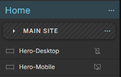
In the left-hand panel, you’ll see Hero-Desktop and Hero-Mobile. Only one version is visible on each layout, so an element that appears hidden may still be in use on the other.
TO UPDATE YOUR HERO
Update the images, text, and button within both the desktop and mobile versions of the hero. Since these are separate elements, changes made to one will not automatically carry over to the other.
A QUICK TIP — Don’t delete the hidden version of the hero. It is intentionally hidden on one layout and displayed on the other.
02 — Project Gallery
The Home page includes a featured project gallery built using three Canvas Views. Each view showcases a different project and contains its own project image, project name, service or project type, and link.
TO UPDATE YOUR PROJECTS
Select the Project Gallery canvas in the left-hand panel, then work through View 1, View 2, and View 3 one at a time. Replace the existing images and text in each view with your own project content.
Be sure to update the View Project link in each Canvas View so it leads to the correct project or portfolio page if needed.
ADDING ANOTHER PROJECT
If you’d like to feature more than three projects, duplicate one of the existing Canvas Views and replace its content with your new project. Duplicating an existing view will preserve the layout, spacing, and styling.
A QUICK NOTE — The elements within each Canvas View are carefully positioned so the projects transition seamlessly without shifting the layout. Avoid moving or repositioning these elements to preserve the effect.
NEED MORE HELP WITH CANVAS VIEWS?
Showit has a full guide explaining how Canvas Views work and how to edit them.


03 — Service Card Links
The service cards on the Home page are linked to their corresponding services on the Services page. Because the Services page uses a sticky, stacking layout, these links point to small Link Buffer canvases positioned directly above each service rather than to the service cards themselves.
TO UPDATE YOUR SERVICE LINKS
The service cards on the Home page appear in the same order as the stacking service cards on the Services page. Each Home page card is linked to the Link Buffer directly above its corresponding service.
When updating a service, keep its Home page card linked to the matching Link Buffer:
Service 01 → Link Buffer 1
Service 02 → Link Buffer 2
Service 03 → Link Buffer 3
Each Link Buffer is positioned directly above its service card so visitors land in the correct place within the stacking layout.
A QUICK NOTE — The Link Buffer canvases may look like empty space in the editor, but they’re intentional and are part of the service navigation. Avoid deleting, resizing, or repositioning them, as doing so may affect where visitors land on the Services page.


04 — Testimonial Slider
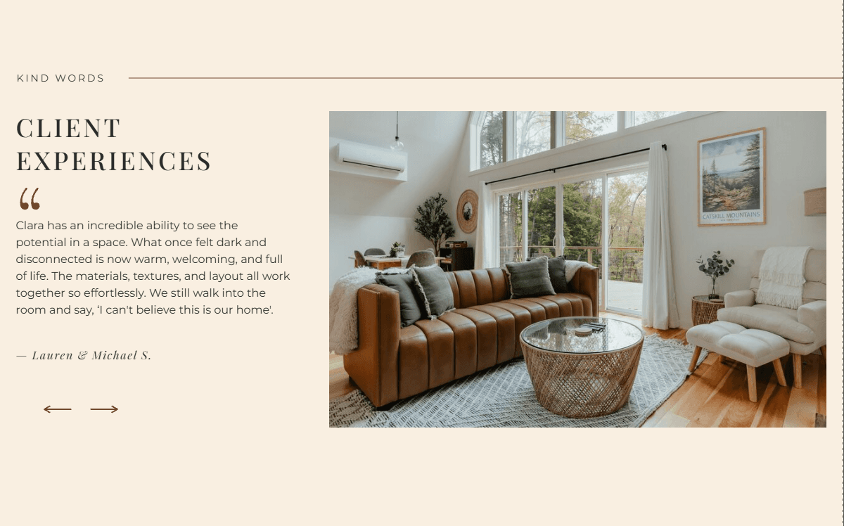
The Home page testimonial section contains four testimonials built using Canvas Views, just like the Project Gallery above. Each view contains one testimonial, including the client name, testimonial text, and image.
TO UPDATE YOUR TESTIMONIALS
Select the Testimonials canvas in the left-hand panel, then work through Experience 1, Experience 2, Experience 3, and Experience 4 one at a time. Replace the existing content in each view with your own client testimonial.
ADDING ANOTHER TESTIMONIAL
If you’d like to add another testimonial, duplicate one of the existing Canvas Views and replace its content. This will preserve the placement and styling of the existing testimonial design.
The Previous and Next arrows are already set up to move visitors between the Canvas Views, so you shouldn’t need to change them when simply replacing the existing content.
A QUICK NOTE — The elements within each Canvas View are carefully positioned so the projects transition seamlessly without shifting the layout. Avoid moving or repositioning these elements to preserve the effect.

About Page
01 — Hero Image Galleries
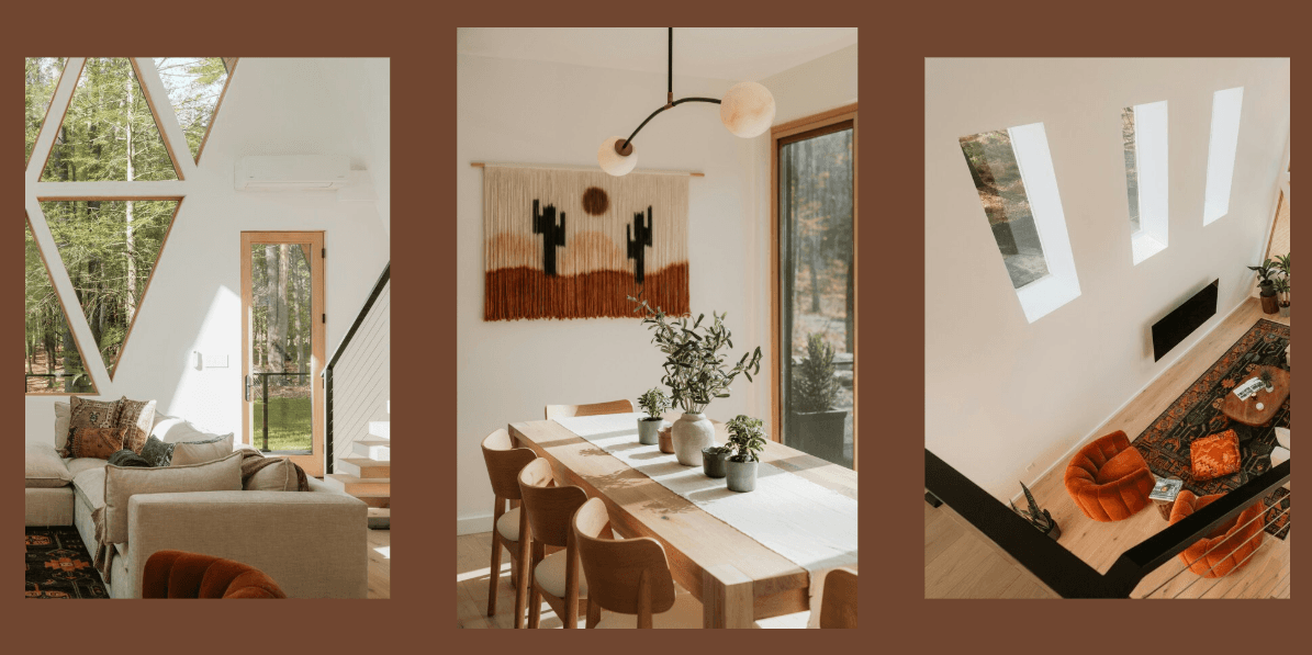
The About page hero includes three image galleries on desktop, allowing multiple images to rotate independently within the layout. On mobile, the layout is simplified to display just one of these galleries.
TO UPDATE YOUR IMAGES
Select each gallery in the desktop hero and open Gallery Images in the right-hand panel. Replace the existing images with your own and arrange them in the order you’d like them to appear.
When you’re finished, switch to the mobile layout and review the gallery shown there to make sure the images work well within the smaller layout.
A QUICK NOTE — Only one of the three galleries is visible on mobile. The other two are intentionally hidden to create a cleaner mobile layout, so there’s no need to unhide or recreate them.


Services Page
01 — Stacking Service Cards
The Services page uses a sticky stacking layout that allows each service card to layer over the previous one as you scroll, creating a tabbed-folder effect.
Each service is contained within its own canvas and positioned to create this scrolling effect. When replacing your content, you can update the text and images within each service card while keeping the existing canvas layout and positioning in place.
USING THE HOME PAGE SERVICE LINKS?
The Home page service cards are connected to the Link Buffer canvases within this section. See Home → Service Card Links above for instructions on updating those links.
A QUICK NOTE — Avoid resizing, repositioning, or rearranging the service canvases unless you intentionally want to change the stacking effect. The spacing and placement of these sections are what allow the cards to stack correctly as visitors scroll.

02 — Testimonial Slider
The Services page includes the same Canvas View testimonial slider used on the Home page.
To update the testimonials, follow the instructions above under Home → Testimonial Slider. The same process applies here.

Projects Page
01 — Hero Sliding Gallery
The Projects page hero includes an auto-scrolling image gallery designed to continuously showcase your work as visitors enter the page.
TO UPDATE YOUR GALLERY
Select the gallery in Showit, then open Gallery Images in the right-hand panel. Replace the existing images with your own and drag them into the order you’d like them to appear.
The gallery is already configured to automatically advance, loop through your images, and maintain the spacing and sizing used in the original design.
A QUICK NOTE — You shouldn’t need to adjust the Gallery Settings when simply replacing your images. Keeping the existing settings in place will preserve the intended movement, spacing, and layout of the gallery.


Featured Project Page
01 — Hero Sliding Gallery
The Featured Project page includes the same auto-scrolling gallery used on the Projects page.
To update the gallery, follow the instructions above under Projects → Hero Sliding Gallery
02 — Color Palette
The Design Direction section includes five color swatches for showcasing the palette used within the project. Each color is built from two overlapping shapes and a text label, which are grouped together to make them easier to edit and position.
TO UPDATE YOUR COLOR PALETTE
In the left-hand panel, expand the group for the color you’d like to change.
Inside, you’ll find:
Frame — the offset square behind the color
Swatch — the main color square
Text — the name of the color
Select the Swatch and update its fill color in the right-hand panel. Then update the text with the name of your new color. Repeat this process for each swatch you’d like to change.
A QUICK NOTE — Keep the Frame, Swatch, and text grouped together when editing or repositioning a color. This helps preserve the overlapping layout and spacing of each palette swatch.


YOU’RE ALL SET
Now, make it yours.
You know your way around Heirloom and the features built into your template. From here, you can customize it to fit your brand, your work, and your business. And if you need a little help along the way, I’m here.
Need a Little Help?
Contact Support
Your FoxAura template includes 30 days of email support for template-related questions. If you get stuck, have a question, or something doesn’t seem quite right as you customize your site, reach out and I’ll be happy to help.
Want me to take it from here?
Template Customization
Love your template, but don’t want to customize it yourself? I’ll customize your FoxAura template with your brand, content, and imagery and get it ready to launch in just one week.